(a) |
(b) |
(c) |
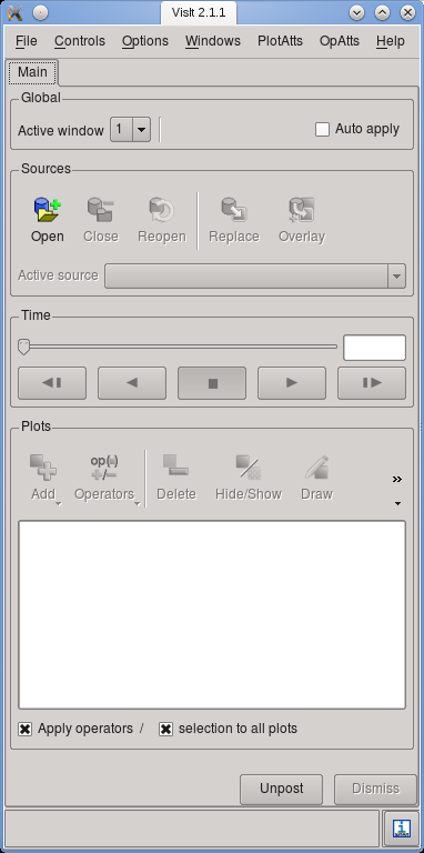
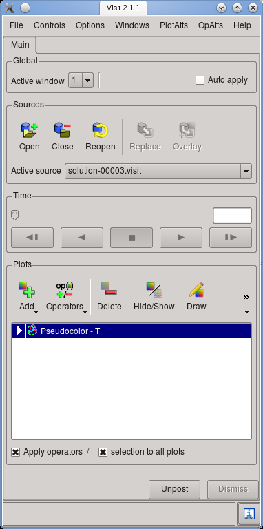
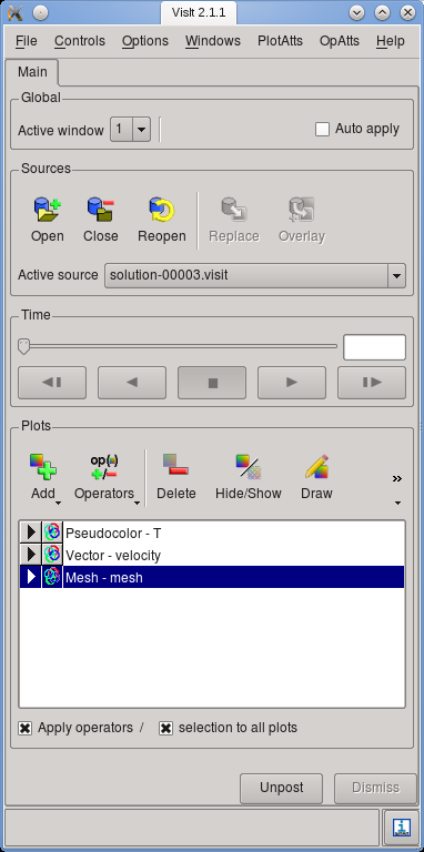
Figure 3: Main window of Visit, illustrating the different steps of adding content to a visualization.
Among the postprocessors that can be selected in the input parameter file (see Sections 4.1 and ??) are some that can produce files in a format that can later be used to generate a graphical visualization of the solution variables and at select time steps, or of quantities derived from these variables (for the latter, see Section 6.3.9).
By default, the files that are generated are in VTU format, i.e., the XML-based, compressed format defined by the VTK library, see http://public.kitware.com/VTK/. This file format has become a broadly accepted pseudo-standard that many visualization program support, including two of the visualization programs used most widely in computational science: Visit (see https://visit.llnl.gov/) and ParaView (see http://www.paraview.org/). The VTU format has a number of advantages beyond being widely distributed:
In the following, let us discuss the process of visualizing a 2d computation using Visit. The steps necessary for other visualization programs will obviously differ but are, in principle, similar.
To this end, let us consider a simulation of convection in a box-shaped, 2d region (see the “cookbooks” section, Section 5, and in particular Section 5.2.1 for the input file for this particular model). We can run the program with 4 processors using
Letting the program run for a while will result in several output files as discussed in Section 4.1 above.
In order to visualize one time step, follow these steps:14
|
(a) |
|
(b) |
|
(c) |
(a) |
(b) |
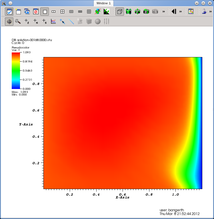
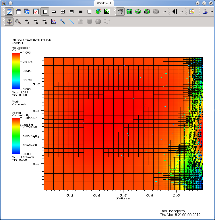
Let us choose the “Pseudocolor” item and select the temperature field as the quantity to plot. Your main window should now look as shown in Fig. 3(b). Then hit the “Draw” button to make Visit generate data for the selected plots. This will yield a picture such as shown in Fig. 4(a) in the display window of Visit.
More information on all of these topics can be found in the Visit documentation, see https://visit.llnl.gov/. We have also recorded video lectures demonstrating this process interactively at http://www.youtube.com/watch?v=3ChnUxqtt08 for Visit, and at http://www.youtube.com/watch?v=w-_65jufR-_bc for Paraview.
In addition to the graphical output discussed above, ASPECT produces a statistics file that collects information produced during each time step. For the remainder of this section, let us assume that we have run ASPECT with the input file discussed in Section 5.2.1, simulating convection in a box. After running ASPECT, you will find a file called statistics in the output directory that, at the time of writing this, looked like this: This file has a structure that looks (at the time of writing this section) like this:
In other words, it first lists what the individual columns mean with a hash mark at the beginning of the line and then has one line for each time step in which the individual columns list what has been explained above.15
This file is easy to visualize. For example, one can import it as a whitespace separated file into a spreadsheet such as Microsoft Excel or OpenOffice/LibreOffice Calc and then generate graphs of one column against another. Or, maybe simpler, there is a multitude of simple graphing programs that do not need the overhead of a full fledged spreadsheet engine and simply plot graphs. One that is particularly simple to use and available on every major platform is Gnuplot. It is extensively documented at http://www.gnuplot.info/.
Gnuplot is a command line program in which you enter commands that plot data or modify the way data is plotted. When you call it, you will first get a screen that looks like this:
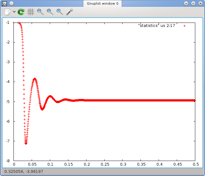
At the prompt on the last line, you can then enter commands. Given the description of the individual columns given above, let us first try to plot the heat flux through boundary 2 (the bottom boundary of the box), i.e., column 19, as a function of time (column 2). This can be achieved using the following command:
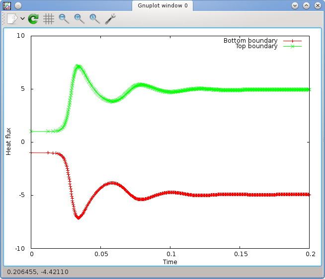
The left panel of Fig. 5 shows what Gnuplot will display in its output window. There are many things one can configure in these plots (see the Gnuplot manual referenced above). For example, let us assume that we want to add labels to the - and -axes, use not just points but lines and points for the curves, restrict the time axis to the range and the heat flux axis to , plot not only the flux through the bottom but also through the top boundary (column 20) and finally add a key to the figure, then the following commands achieve this:
If a line gets too long, you can continue it by ending it in a backslash as above. This is rarely used on the command line but useful when writing the commands above into a script file, see below. We have done it here to get the entire command into the width of the page.
For those who are lazy, Gnuplot allows to abbreviate things in many different ways. For example, one can abbreviate most commands. Furthermore, one does not need to repeat the name of an input file if it is the same as the previous one in a plot command. Thus, instead of the commands above, the following abbreviated form would have achieved the same effect:
This is of course unreadable at first but becomes useful once you become more familiar with the commands offered by this program.
Once you have gotten the commands that create the plot you want right, you probably want to save it into a file. Gnuplot can write output in many different formats. For inclusion in publications, either eps or png are the most common. In the latter case, the commands to achieve this are
The last command will simply generate the same plot again but this time into the given file. The result is a graphics file similar to the one shown in Fig. 8 on page 147.
What makes Gnuplot so useful is that it doesn’t just allow entering all these commands at the prompt. Rather, one can write them all into a file, say plot-heatflux.gnuplot, and then, on the command line, call
to generate the heatflux.png file. This comes in handy if one wants to create the same plot for multiple simulations while playing with parameters of the physical setup. It is also a very useful tool if one wants to generate the same kind of plot again later with a different data set, for example when a reviewer requested additional computations to be made for a paper or if one realizes that one has forgotten or misspelled an axis label in a plot.16
Gnuplot has many many more features we have not even touched upon. For example, it is equally happy to produce three-dimensional graphics, and it also has statistics modules that can do things like curve fits, statistical regression, and many more operations on the data you provide in the columns of an input file. We will not try to cover them here but instead refer to the manual at http://www.gnuplot.info/. You can also get a good amount of information by typing help at the prompt, or a command like help plot to get help on the plot command.
Among the challenges in visualizing the results of parallel computations is dealing with the large amount of data. The first bottleneck this presents is during run-time when ASPECT wants to write the visualization data of a time step to disk. Using the compressed VTU format, ASPECT generates on the order of 10 bytes of output for each degree of freedom in 2d and more in 3d; thus, output of a single time step can run into the range of gigabytes that somehow have to get from compute nodes to disk. This stresses both the cluster interconnect as well as the data storage array.
There are essentially two strategies supported by ASPECT for this scenario:
14The instructions and screenshots were generated with Visit 2.1. Later versions of Visit differ slightly in the arrangement of components of the graphical user interface, but the workflow and general idea remains unchanged.
15With input files that ask for initial adaptive refinement, the first time step may appear twice because we solve on a mesh that is globally refined and we then start the entire computation over again on a once adaptively refined mesh (see the parameters in Section ?? for how to do that).
16In my own work, I usually save the ASPECT input file, the statistics output file and the Gnuplot script along with the actual figure I want to include in a paper. This way, it is easy to either re-run an entire simulation, or just tweak the graphic at a later time. Speaking from experience, you will not believe how often one wants to tweak a figure long after it was first created. In such situations it is outstandingly helpful if one still has both the actual data as well as the script that generated the graphic.